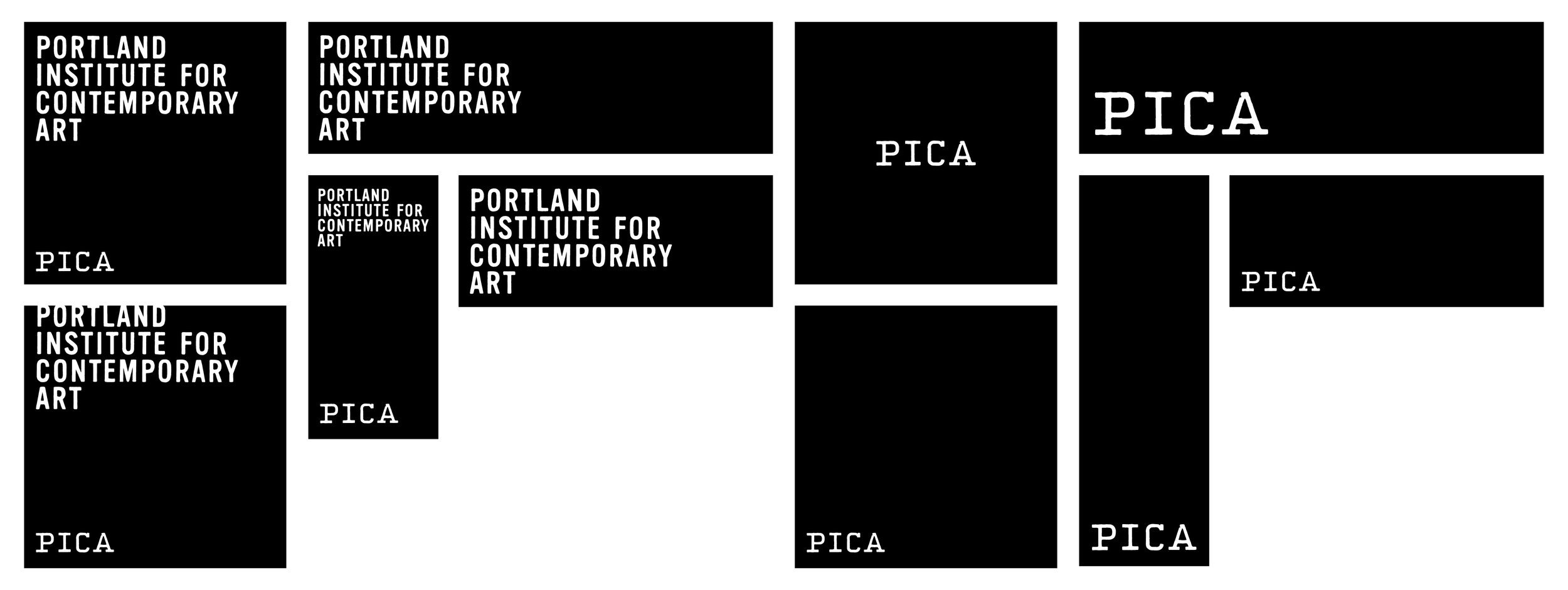
Portland Institute for Contemporary Art ID
Our Role*: Concepting, Art Direction + Design
PICA’s long-lived and well-recognized identity was a core part of the Portland arts organization’s 17-year grass-roots heritage, but some fundamental issues developed with the logo as they progressed as an organization. We kept the integrity of the letterform shapes (and the typewriter aesthetic), and modified them to be cleaner, scalable, and less jagged. At a small scale, the difference is slightly noticeable—but not shocking—and at large scale, it really cleans up. A simple fluorescent yellow highlighter stripe works well with the refined typewriter approach.
Our identity package included: logo re-work, brand color palette & typography, stationary suite, event-specific postcard treatments, posters, wayfinding, and signage.
*Completed at Makelike, while Topher was a partner there.


